Custom Visualizations
Visualization is an individual number, table or chart that shows one or more metrics. Optionally you can segment the metrics by one or more attributes. You can also filter the metrics by one or more attributes. You can use multiple visualizations in a dashboard to look on a data from several different perspective at once.
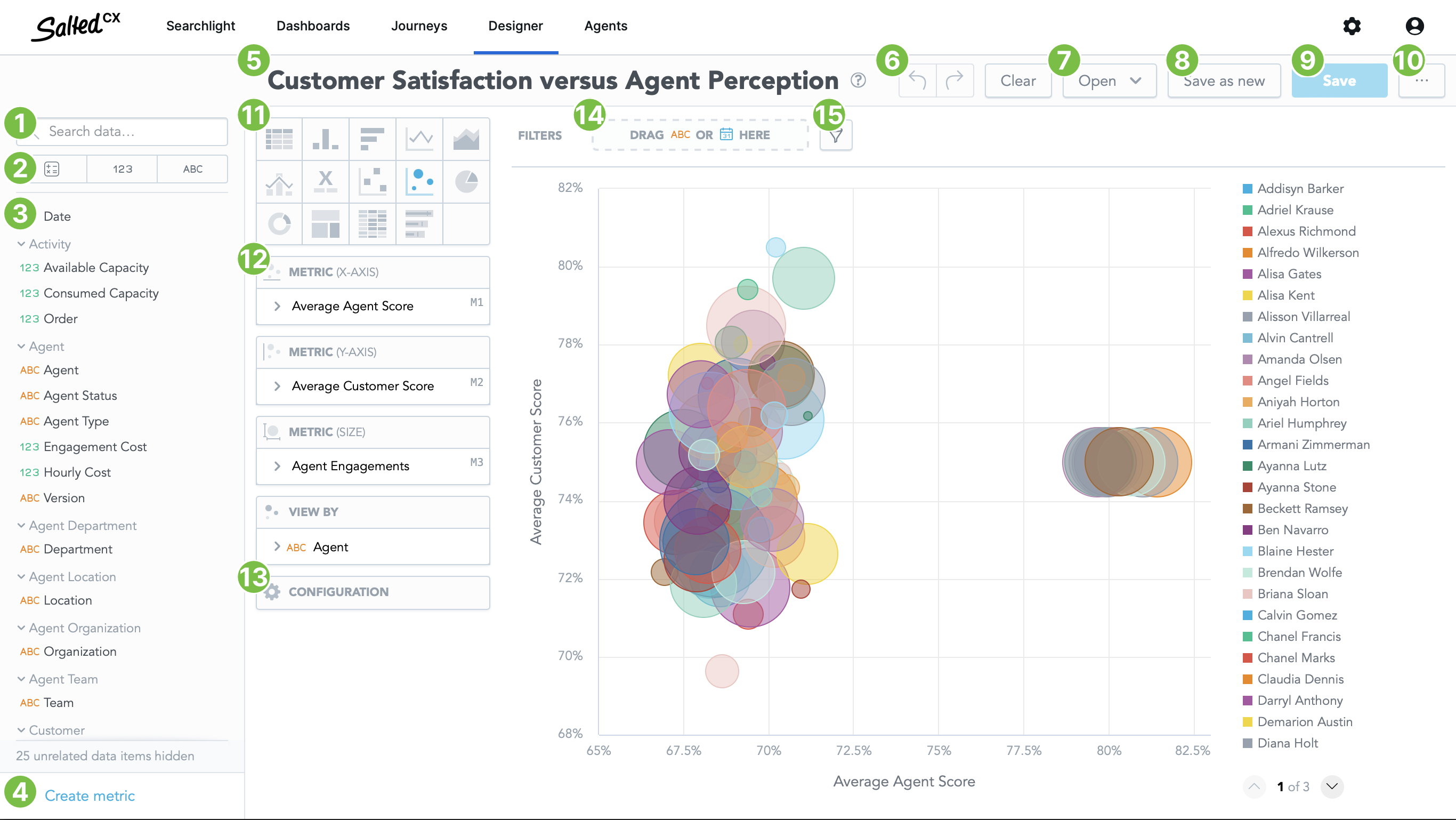
To start building a visualization click the Designer tab in the top bar. You can build new visualizations with drag and drop without the need to have deep technical skills. You can use many of the metrics and attributes included out of the box or any metrics that you or you colleagues created in your account.
Do not be afraid to experiment when building a new visualization. You can easily use redo and undo to go many steps back and forward. You do not lose your work when going in a wrong direction for a while.

Data Items
On the right side you have building blocks available for your visualization. You can drag and drop data items from here into
Search
You can use Search data… 1 field to filter available metrics, facts and attributes. Search matches any word in the metric, fact or attribute title.
Categories
You can use the button bar with metrics, attributes and facts 2 to show only them. If you are searching for one of those it helps you to narrow the options.
Data Items List
Drag and drop items from Data Items list 3 to the canvas to include them in your visualization. Depending on the Data Item type different areas are highlighted to indicate where you can use the given item.
Hover over any of the data items. Question mark will appear. Hover over the question mark icon to see more details about any data item.
Create metric
Press Create metric button 4 if there is no metric that provides the values you would like to see in your insight.
Tool Bar
Insight Name
Click the insight name 5 to rename it.
Undo / Redo / Clear
Undo 6 returns the insight one step back. Click undo when you went into a direction that you wanted. You can undo multiple steps so you do not have to be afraid to experiment and try every avenue when exploring your data.
Redo repeats the step you have previously stepped back by using undo.
Clear removes all metrics, attributes and filters from the insight. Use it to clearly start with a clean slate.
Open Existing Insight
Open button 7 lists all the insights you have access to. You can use search to narrow down the choices.
Save as New
Save as New button 8 saves the current insight without overwriting the insight you have started with.
Save
Save button 9 saves the insight in the current state. If you have edited an existing insight the insight gets updated and the previous version is overwritten. The insight is updated in all dashboards that include it.
More
Use the More button 10 to export the current insight into one of the formats:
- XLXS for working with the file in Excel.
- CVS for machine processing the data.
Insight Options
The pane next to the building blocks contains the definition of you insight.
Insight Visualization

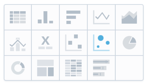
You can switch visualization type 11 while keeping metrics, attributes and filters you have used in a different visualization. So you can experiment which visualization is the best to highlight metrics that are important for you.
- Table. Universal starting point for showing a lot of data segmented by many dimensions. Table can be more difficult for people to find outliers and other items should stand out. Consider using different visualization, sorting the table or using conditional highlighting to make interesting number stand out.
- Column Chart. Good for representing volume (number of engagements) in distinct categories such as date.
- Bar Chart. Great for creating visual leaderboards that highlight differences between volume (number of something) in different categories. You can use top/bottom filters and sort the chart to have a great leaderboard.
- Line Chart. Line chart is great for showing a metric (average times, scores, etc.) how they changed over time.
- Area Chart. Alternative to column chart.
- Combo chart. Enables to combine metrics shown in columns, line and area to easily distinguish them. You can use multiple axis to show metrics that use different units or have order of magnitude different values.
- Headline. Single large number good for communicating the most important metrics on top of a dashboard.
- Scatter Chart. Great for comparing 2 different metrics and understanding relationship (correlation) between them.
- Bubble Chart. Great for comparing 2 different metrics and understanding relationship (correlation) between them. Compared to scatter chart you can also use bubble size to indicate a third metric. The size of the bubble is great to indicate whether the item is wort your attention.
- Pie Chart. Good for communicating a ratio in volume by a different category in a way that is similar to headline and communicates overall performance.
- Donut Chart. Good for communicating a ratio in volume by a different category in a way that is similar to headline and communicates overall performance.
- Bullet Chart. Great for showing the current metrics and comparing them to targets you want to reach.
Visualization Metrics and Attributes
Into metrics and attributes area 12 you can drag and drop data items for the Data Items list 3 to build your insight. The number of slots and what they represent differs by visualization type 11.
Visual Configuration
Visual options 13 do not have direct impact what data the visualization shows but enables you to configure how the data are presented including colors, axis and canvas settings. The options differ by visualization type 11 .
Filters Bar
Into filter bar 14 you can drag and drop attributes from the Data Items list 3 to narrow down the visible data. Note that any filtering criteria added to the filter bar are overridden by dashboard filters. So you can create an unfiltered insight or filter it to same values that is easier to work. Users can then choose different filters in a dashboard that override those in the insight.
Add Filter
Add filter button 15 enables you to add more complex filtering options. You can filter by metric used in the insight or use top/bottom filtering to show only a few first items that have highest or lowest value.